Have you ever downloaded an app, opened it once, and immediately deleted it? You’re not alone. The difference between apps that succeed and those that fail often comes down to one critical factor: app UI UX design.
In Calgary’s competitive business environment, your app’s design isn’t just about making things look pretty, it’s about creating experiences that solve real problems for your users. Whether you’re a startup founder with a breakthrough idea or an established business expanding into mobile, understanding the design process can mean the difference between an app that drives revenue and one that drains your budget.
This guide walks you through everything you need to know about transforming your app concept into a polished, user-friendly product that Calgary businesses and consumers actually want to use.
Why UI/UX Design Determines Your App’s Success in Calgary’s Market
Calgary’s business landscape demands excellence. Your potential users whether they’re energy sector professionals, healthcare workers, or retail customers have high expectations shaped by world-class apps they use daily.
Design determines whether users embrace your solution or abandon it within seconds. It’s not about following trends blindly; it’s about understanding how people interact with technology and removing every possible friction point between them and their goals.
Think about your own phone right now. The apps you use most aren’t necessarily the ones with the most features, they’re the ones that feel intuitive, respond quickly, and help you accomplish tasks without frustration.
The Business Impact of Poor App Design
The numbers tell a sobering story. Research shows that 88% of users abandon apps after a bad experience, and they’re unlikely to give you a second chance. Even more striking: first impressions form within 50 milliseconds of interaction faster than you can consciously process what you’re seeing.
- 88% of users abandon apps after a bad experience – They’re unlikely to give you a second chance, making that first interaction absolutely critical to your app’s success.
- First impressions form within 50 milliseconds of interaction – This is faster than you can consciously process what you’re seeing, meaning users judge your app almost instantly.
What does this mean for your Calgary business? Every confusing button, every slow-loading screen, and every unclear instruction costs you users and revenue. Poor design compounds over time, creating support tickets, negative reviews, and ultimately, failed products.
The financial impact extends beyond lost users. Fixing design problems after development costs 10-100 times more than addressing them during the UI UX design process. Every hour spent refining your design upfront saves days of expensive development rework later.
Understanding the App Design Process
Professional app design follows a structured approach that reduces risk and increases your chances of market success. It’s not a linear path you’ll move back and forth between stages as you learn more about your users and refine your solution.
The process begins with research: understanding your target users, their pain points, and their goals. This foundation informs every design decision that follows. Without this clarity, you’re essentially guessing what users want and guesses are expensive when they’re wrong.
From there, you’ll progress through wireframing, visual design, prototyping, and testing before a single line of code gets written. This approach feels slower initially, but it dramatically accelerates your overall timeline by preventing costly mistakes.
From Concept to Visual Reality: The Complete Design Workflow
Transforming your app idea into something tangible requires moving through distinct design phases, each building on the last.
Wireframing: Building Your App’s Blueprint
Wireframes are the skeletal structure of your app’s simple, grayscale layouts that show where elements go without the distraction of colors, images, or detailed styling. Think of them as architectural blueprints for your digital product.
During app wireframing and prototyping, you’re making crucial decisions about information hierarchy, navigation structure, and content placement. Should the search bar go at the top or bottom? How many taps should it take to complete a purchase? Where should critical information appear?
These low-fidelity wireframes let you test multiple layout options quickly and cheaply. You can sketch ten different approaches in the time it would take to create one polished mockup, making this the ideal stage for experimentation and stakeholder feedback.
Mockups: Bringing Visual Identity to Life
Once your wireframes establish the structure, mockups add the visual polish colors, typography, imagery, and brand elements that transform gray boxes into something that looks like the final product.
This is where your brand personality emerges. Are you targeting Calgary’s corporate sector with professional, conservative aesthetics? Or are you building a consumer app that needs to feel friendly and approachable?
Mockups should match your target audience’s expectations while standing out enough to be memorable. They also serve as a communication bridge with your development team, showing exactly how the finished product should look.
Clickable Prototypes: Testing Before Development
Static mockups show what your app will look like, but clickable prototype design demonstrates how it will actually work. These interactive prototypes let users tap through screens, experiencing the flow and interactions before any real development begins.
Prototyping tools allow you to add transitions, animations, and conditional logic that simulate real app behavior. This lets you conduct user testing sessions where people interact with your “app” and provide feedback on what works and what doesn’t.
The insights you gain here are invaluable. Watching someone struggle with a navigation pattern you thought was obvious can completely change your design direction and it’s far better to discover these issues now than after launch.
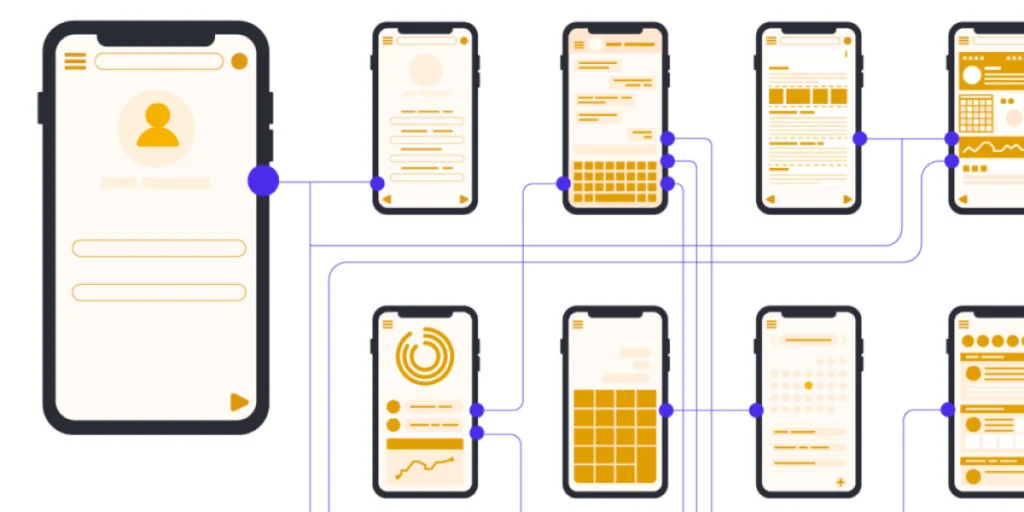
User Journeys and User Flows: Mapping the Path to Success
Understanding how users move through your app is fundamental to creating intuitive experiences that feel effortless.
What Is the Difference Between User Journeys and User Flows?
These terms often get used interchangeably, but they serve different purposes in the design process.
User journeys are broad, narrative descriptions of a user’s experience with your product over time. They include emotions, pain points, and touchpoints across multiple channels. A user journey might describe how a Calgary professional discovers your app, downloads it, uses it daily, and eventually recommends it to colleagues.
User flows, by contrast, are specific, tactical diagrams showing the exact steps a user takes to complete a task within your app. They map out every screen, decision point, and potential path from entry to completion. A user flow might show the precise sequence: login screen → dashboard → settings → notification preferences → confirmation.
Both tools inform your design decisions, but at different levels. User journeys help you understand the big picture context, while user flows help you optimize specific interactions.
Creating Intuitive Navigation for Calgary Business Users
Calgary’s professional users expect efficiency above all else. They’re busy people who need to accomplish tasks quickly, often while juggling multiple responsibilities.
Your navigation should follow established patterns that users already understand from other professional tools they use daily. Don’t reinvent the wheel unless you have compelling reasons familiarity reduces cognitive load and speeds up adoption.
Consider the context in which Calgary users will interact with your app. Are they in the field on a work site? In an office environment? On the go between meetings? Each context demands different navigation approaches and interaction patterns.
Design Standards for Calgary’s Professional Audience
Calgary’s business culture shapes user expectations in ways that differ from coastal tech hubs or consumer-focused markets.
Adapting UI/UX for Calgary’s Business Culture
The design aesthetic that works for a San Francisco consumer app might feel too casual for Calgary’s corporate environment. Your app design best practices should reflect the conservative yet modern sensibilities that characterize the local business culture.
- Conservative yet modern aesthetics that reflect local professionalism – Clean layouts, professional typography, and thoughtful use of whitespace convey competence and reliability. This doesn’t mean boring, it means purposeful.
- Accessibility compliance and inclusive design for diverse workforces – Calgary’s diverse workforce includes users with varying abilities. Inclusive design ensures everyone can use your product effectively through proper color contrast, screen reader support, keyboard navigation, and clear visual hierarchies.
This doesn’t mean boring, it means purposeful. Color should enhance usability rather than overwhelm, and animations should feel smooth and purposeful rather than frivolous.
Industry-Specific Design Considerations
Different Calgary industries have unique design requirements based on their operational realities and user needs.
Energy sector apps might need to work in environments with poor connectivity, requiring offline functionality and efficient data synchronization. Healthcare applications must balance ease of use with stringent privacy requirements and compliance standards.
Retail and hospitality apps need to handle high transaction volumes while maintaining speed and reliability during peak periods. Understanding these industry-specific constraints shapes design decisions from the earliest wireframing stages.
App Branding and Visual Identity
Your app isn’t separate from your brand, it’s an extension of it. Every design choice either reinforces or undermines your brand positioning.
Establishing Consistent Brand Language
Brand consistency means users should instantly recognize your app as part of your broader business ecosystem. This goes beyond slapping your logo in the corner; it’s about creating a cohesive visual and interaction language.
Your app’s personality should match your brand’s voice. A financial services app should feel secure and trustworthy. A fitness app should feel energetic and motivating. These aren’t just aesthetic choices, they’re strategic decisions that influence how users perceive and interact with your product.
Document your design system: the specific colors, typography, spacing, and component styles that define your app’s look and feel. This ensures consistency as your app grows and makes it easier to hand off designs to mobile app design tools and development teams.
Color Psychology and Typography for Calgary Audiences
Color choices carry psychological weight. Blue conveys trust and professionalism and notice how many financial and healthcare apps use it. Green suggests growth and sustainability, fitting for environmental or wellness applications.
For Calgary’s professional market, err toward sophisticated color palettes rather than aggressive, high-contrast schemes. Your primary color should align with your brand while providing sufficient contrast for accessibility.
Typography impacts readability more than most people realize. Choose fonts that remain legible at small sizes, especially for information-dense business applications. System fonts like San Francisco (iOS) and Roboto (Android) work well because users already see them throughout their devices.

Essential Design Tools for Professional App Development
The right tools streamline your workflow and improve collaboration between designers, stakeholders, and developers.
Design Tool Comparison
Tool | Best For | Prototyping | Collaboration | Learning Curve | Price Range |
Figma | Full design workflow | Yes | Excellent | Moderate | Free – $45/mo |
Adobe XD | Adobe ecosystem users | Yes | Good | Moderate | $9.99/mo |
Sketch | Mac-based designers | Limited | Good | Easy | $99/year |
InVision | Interactive prototypes | Excellent | Excellent | Easy | Free – $95/mo |
Figma has become the industry standard for most design teams because of its real-time collaboration features and browser-based accessibility. Multiple team members can work simultaneously, and stakeholders can view designs without installing software.
Adobe XD integrates seamlessly if you’re already using other Adobe Creative Cloud tools, making it a natural choice for teams with existing Adobe workflows.
Sketch dominated the Mac design market for years and still has a loyal following, though its collaboration features lag behind Figma’s.
InVision excels at prototyping and gathering feedback but is often used alongside other design tools rather than as a complete solution.
How Does UI/UX Design Impact App Retention and Revenue?
Quality design isn’t an expense, it’s an investment that directly impacts your bottom line.
Measurable Benefits of Quality Design
Well-designed apps see significantly higher retention rates. Users who have positive initial experiences are more likely to return, recommend your app to others, and tolerate minor issues when they occur.
Conversion rates improve dramatically when friction points are removed. Every simplified form, clearer call-to-action, and faster load time translates directly to more completed transactions or sign-ups.
Support costs decrease when interfaces are intuitive. Users who can figure things out themselves don’t need to contact support, freeing your team to focus on higher-value activities.
Case Applications in Calgary Industries
Calgary businesses that invest in thoughtful design consistently outperform competitors with poorly designed solutions. In the energy sector, field service apps with intuitive interfaces reduce training time and increase worker productivity in remote locations.
Healthcare providers using well-designed patient portals see higher engagement rates and better health outcomes as patients find it easier to schedule appointments, refill prescriptions, and access their records.
For a comprehensive overview of how design fits into the broader context of building successful business applications, our guide on “Application Development in Calgary – Complete 2026 Guide for Businesses & Startups” covers the full development lifecycle and strategic considerations.
Design Deliverables: What Calgary Clients Should Expect
Understanding what you’ll receive from your design team prevents misunderstandings and ensures smooth transitions to development.
Comprehensive Design Packages
A complete design package should include wireframes for all key screens and user flows, high-fidelity mockups showing the final visual design, interactive prototypes for testing and stakeholder review, and a documented design system with reusable components and style guidelines.
You should also receive user flow diagrams, accessibility documentation, and responsive designs showing how your app adapts to different screen sizes and orientations.
Handoff Documentation for Development Teams
The transition from design to development requires clear documentation. Developers need precise specifications: exact spacing measurements, color codes, font sizes, and interaction details.
Modern design tools can generate much of this documentation automatically, providing CSS code snippets and design specs that developers can reference directly. This reduces ambiguity and ensures the final product matches the approved designs.
Your design team should remain available during development to answer questions and make minor adjustments as technical constraints emerge. Design isn’t a “throw it over the wall” process; collaboration continues through launch and beyond.
Elevate Your App with Chameleon Ideas’ Design Expertise
Ready to transform your app concept into a beautifully designed product that Calgary users love? Chameleon Ideas specializes in creating intuitive, user-centered designs that drive real business results for Calgary companies.
We’ve helped businesses across industries from energy to healthcare to retail launch successful apps that users actually want to use. Our team brings expertise in the complete design workflow, from initial wireframing through prototyping and developer handoff, ensuring your vision becomes reality.
Whether you’re launching your first app or redesigning an existing product, we guide you through every step of the design process, helping you make informed decisions that balance user needs, business goals, and technical constraints.
Let’s discuss your project.
📧 Email: info@chameleon-ideas.com
📞 Phone: +1 519-983-0787
Your app’s success starts with great design. Isn’t it time your users had an experience worth talking about?